A Grid Configuration enables selecting which columns the Object Grid should display for a particular tab (object type), and the order in which they appear. The Grid Configuration dialog allows for columns to be selected and to specify the order of display. The latter is done by re-ordering the items in the list after selecting the fields to display. By default, when defining a new Grid Configuration it is private, meaning it is not visible to other users. A Grid Configuration can be shared by changing its status from Private to Shared meaning it is available to all other users who can see, use, copy and modify the Grid Configuration.
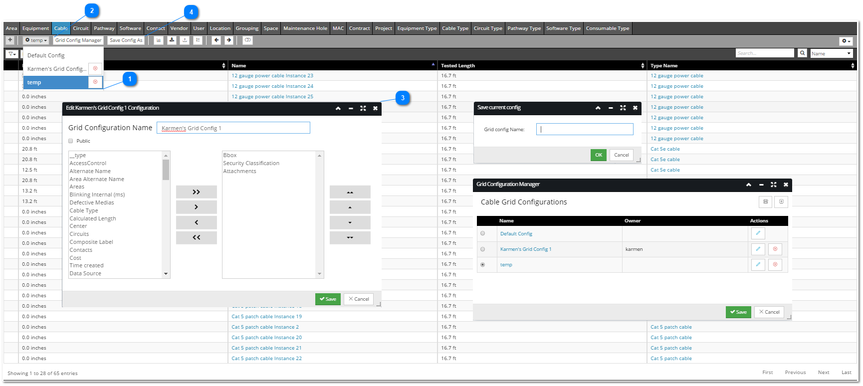
The screenshot below displays all menus and dialogs associated with the Grid Configuration feature and explains them in more detail in the numerated items:
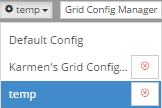
 Set Grid Configuration buttonThe first button in the Grid Configuration group in the Function toolbar enables quickly setting and removing a grid configuration. The button's text displays the name of the currently active (set) grid configuration. Clicking on it opens a drop down menu that lists all public grid configurations and grid configurations owned by the current user. Clicking on one of them sets it as an active grid configuration. In addition, a grid configuration owned by the current user can be removed simply by clicking the red x button next to the grid configuration's name. This is enabled also for the currently active grid configuration.
|
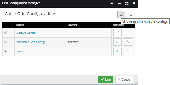
 Grid Config Manager buttonClick on the Grid Config Manager button opens the Grid Configuration Manager dialog displayed below:
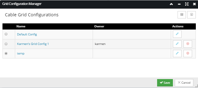
The Grid Configuration Manager dialog displays basic information about existing grid configurations and enables the following activities:
-
view all public grid configurations and private grid configurations that you own
-
view properties for grid configurations you own
-
set an active grid configuration
-
add a new grid configuration
-
edit or delete your own grid configurations
The following columns and action buttons are displayed in this dialog:
-
Name - The name of the grid configuration, displayed as a hyperlink. Clicking on it opens the Edit Grid Configuration sub-dialog (see item 3 for more details) that enables viewing details about a particular configuration.
-
Owner - The name of the IRM User who is the owner / creator of the grid configuration.
Action buttons:
 - Edit Configuration button - A grid configuration is editable only by its owner. Clicking on it opens the Edit Grid Configuration sub-dialog (see item 3 for more details) that enables editing details about a particular configuration.
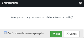
 - Delete Configuration button - A grid configuration is removable only by its owner. Clicking on it opens the action confirmation pop-out sub-dialog that requires either confirming or canceling removal by clicking on the appropriate button.
 - Showing all available (public) configurations toggle button. When active (when this icon is displayed) the grid lists all public grid configurations:
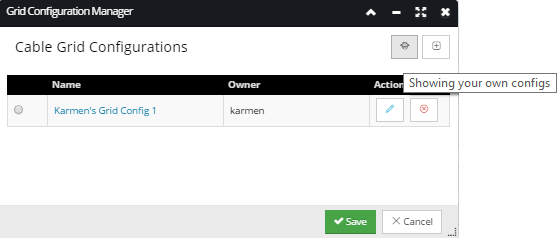
 - Showing your own configurations toggle button. When active (when this icon is displayed) the grid lists only grid configurations owned (created) by the current user:
 - Add New Configuration button - Opens Edit Configuration dialog with no name and no field selected (see item 3 for more details).
A single grid configuration can be selected for a single object type. If selected in the grid in the Grid Configuration Manager dialog, a grid configuration is automatically applied to the selected tab's view in the Object Grid.
|
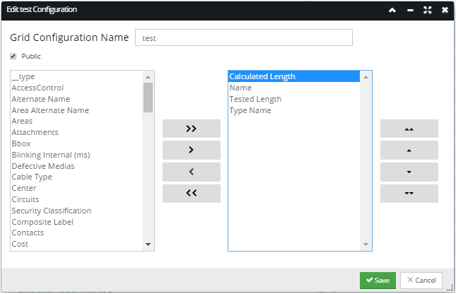
 Edit grid configuration sub-dialog
This sub-dialog opens in several cases:
-
The Add New Configuration button is clicked -
An Edit Configuration button is clicked -
The name of the grid configuration is clicked
This dialog enables selecting which columns to display in the Object Grid for the selected object type from the selected tab in the Object Grid.
The dialog consists of the following parts:
-
Grid Configuration Name - the full name of the grid configuration, which is editable
-
Public checkbox - when checked the grid configuration is set as public - visible and applicable for all users, but enabled for editing and removing only for the owner/creator. When unchecked the grid configuration is set as private - visible, applicable, editable and removable only for the owner/creator.
-
Left-side field list - lists all fields available for display in the Object Grid, for the selected tab. To select a field for display in the Object Grid, click on the field name in this list and click the second (single right arrow button). This moves the selected field from this list and to the right-side list.
-
Right-side field list - lists all fields selected for display in the Object Grid, for the selected tab. To remove a field from display in the Object Grid, click on the field name in this list and click the third (single left arrow button). This moves the selected field from this list and to the left-side list.
-
Left side group of arrow buttons - enable moving selected fields from the left to the right side list (sets the selected fields / columns to display in the Object Grid), as well as from the right to the left side list (sets the selected fields / columns to NOT display in the Object Grid). Additional top and bottom buttons enable moving all fields from one list to another.
 - move all fields from the left-side list to the right-side list. This will make all fields for the selected object type display as columns in the Object Grid.  - move the selected field from the left-side list to the right-side list. This will make the selected field display as a column in the Object Grid for the selected object type.  - move the selected field from the right-side list to the left-side list. This will make the selected field not to display as a column in the Object Grid for the selected object type.  - move all fields from the right-side list to the left-side list. This will make none of the fields for the selected object type display as columns in the Object Grid.
-
Right side group of arrow buttons - enable sorting the order of the fields selected for displaying in the Object Grid. The order of the fields in the right-sided list corresponds to the order of columns selected for displaying in the Object Grid. Clicking on a field in the right-side list and on one of these buttons moves the order of the selected field in the list:
 - Place the selected field on the top row position. This places the selected column in the first (leftmost) position in the Object Grid.  - Place the selected field up one row at a time. This places the selected column left one column at a time in the Object Grid.  - Place the selected field down one row at a time. This places the selected column right one column at a time in the Object Grid.  - Place the selected field on the bottom of the list. This places the selected column in the rightmost position in the Object Grid.
The screenshot above displays an example of adding a field from the left side list to display as a column in the Object Grid. The field is selected (Calculated Length) and the second button from the left side group is clicked. This moves the field from the left side list to the right side one (displayed in the screenshot below):
If the field Calculated Length was added by mistake and does not need to be displayed in the Object Grid, it can be moved back to the left side list by clicking on the single left arrow button (second from last).
|
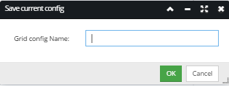
 Save Config As buttonClick on the Save Config As button opens a popup subdialog that displays a text field for entering a name for the new grid configuration.
Once the name is entered, clicking on the OK button closes the sub-dialog, saves the newly created grid configuration and sets it as an active grid configuration for the current Object Grid view. This option is useful as a quick way to create and set a new configuration from the current Object Grid view.
|
|