4.2.2.1. Object Properties dialogs
The most common type of dialog in IRM is the Object Properties, sometimes called Editor dialog. This type of dialog is commonly used for displaying basic properties of Instance, Type, or Category objects.
The following descriptions will help in understanding how the dialogs function:
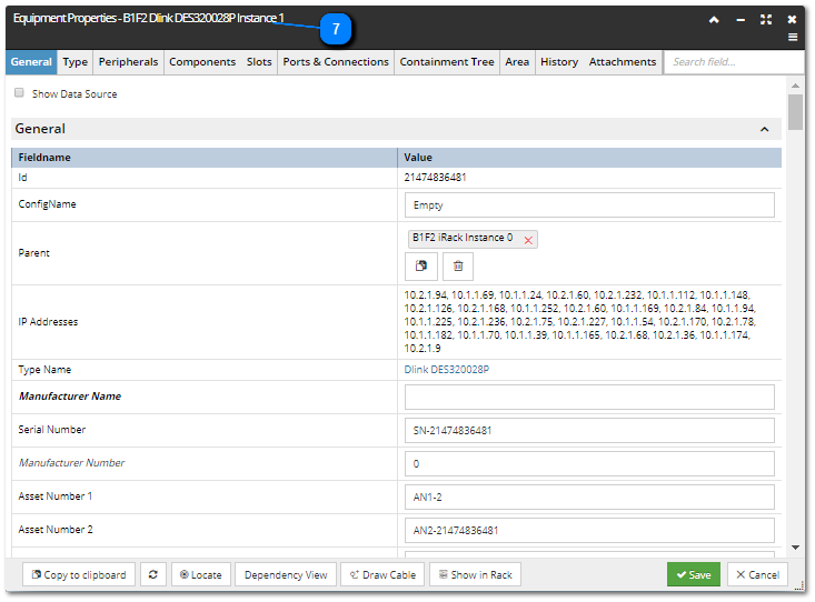
 Dialog title labelThe top-left portion of the dialog is (as standard) reserved for displaying the title (or name) of the dialog itself, in this example its "main" name is "Equipment Properties" and "111/B", separated with a hyphen, represents the name of the (Equipment) object, which properties this dialog displays.
In some cases, additional text labels can be displayed next to the the dialog title, in order to indicate a special mode the dialog is being in. There are different modes that an object Properties dialog can be in:
-
Edit mode, there is no visual indication in the dialog header
-
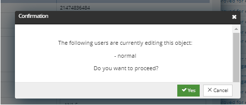
Multiple user Edit mode - indicated by the orange text in the dialog header when the dialog first opens, also containing the name of user(s) already editing the object - 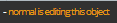 . If the user persists and continues with the changes, an additional confirmation pop-out dialog with similar warning message opens, asking the user to confirm with editing the object:
If confirmed, any change made from that user will immediately affect the object for that and all other users.
-
Creation mode, indicated by blue text in the dialog header - 
-
-
No permission - editing is disabled across all tabs, indicated by the red text in the dialog header -  -
Constant fields - no editing of specific fields is allowed, indicated by the orange text in the dialog header -  -
Library objects - editing of library fields in objects with the Data Source property set to "Irm Default Data" or "Irm Library" is NOT allowed in Non-LCT mode, indicated by the orange text in the dialog header - 
|
 Tab menuA standard tab menu, each of which represents a separate view in the dialog and can be opened simply by clicking on it.
Here are some of the common tabs for some object types:
-
all Type objects contain General, Category, Attachments tabs -
all Instance objects contain General, Type, Category, Attachments tabs
A few notes and caveats to consider:
-
-
The Type tab lists Type-related semantic and non-semantic fields. -
The non-semantic fields are indicated with italic font.
|
 Window controlsThe buttons in the top-right corner of the dialog header are standard controls for managing the dialog's window:
-
Expand / Collapse (toggle button) -
Minimize, Maximize, Close -
click on the menu button opens the object's context menu
|
 Quick SearchThis feature enables filtering the data displayed in the dialog by entering a text string in the Search... text input field.
For example, in the case of the Equipment Properties dialog, if "alternate" is entered in the text box, this would filter out all Equipment-related field-value pairs that do not have a Name containing the text string "alternate" (Alternate Name, Alternate Asset Number, Area Alternate Name, etc.).
Tip: as IRM supports a large number of fields, this feature is often the fastest way to find a specific data item you are looking for.
|
 Confirmation and cancellation buttonsIn most cases, this area of the dialog displays standard Save and Cancel buttons (which save or discard any changes made on the dialog and close it).
|
WARNING: In case the Save button isn't enabled, in general there is a good chance it's because some mandatory field hasn't been filled out, or somehow got deleted or omitted. Make sure you specify all mandatory fields (field name in bold font), especially upon a new object creation.
| |
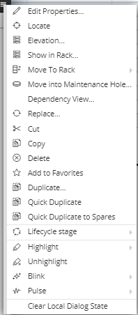
 Additional functional buttonsThe left bottom corner of the Properties / Editor dialogs usually contains additional function buttons, mostly enabling operations with the object in another context.
In this example the following buttons are displayed
-
Copy to Clipboard, which copies the reference of the opened Equipment object to the Clipboard, making it available and easy to copy later, if needed
-
the icon-only button reloads the content of the dialog -
Locate, which focuses the Design World view onto the opened Equipment object
-
Dependency View opens the Dependency View dialog with the opened Equipment object set as starting point
|
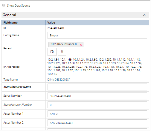
 Content areaDepending on the selected tab, the main content area displays data organized either into standard (Field) Name / Value lists, or into data grids. For more information about selection mechanisms used for data grids, click on the following topic - Selection modes.
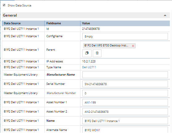
The "Data Source" checkbox on top of the dialog column enables the user to hide or show the Data Source column. The default for the checkbox is false, or not checked. The "Data Source" column in the General tab shows the name of the object from where the data came. In addition to displaying Category names, the column can also hold the name of the Type or the name of the object itself.
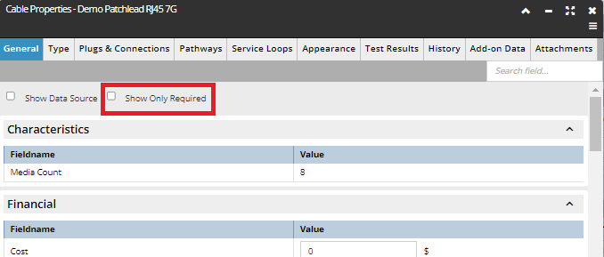
In order to correctly edit or create an object, the user needs to enter specific required fields. Instead of achieving that by searching for all the required fields, there is a dedicated "Show Only Required" checkbox at the top of the dialog that enables the user to quickly switch between required and all (default) fields.
TIP: The "Show Only Required" switching is also enabled when the user clicks on the text, and not necessarily on the checkbox symbol itself.
The "Show Only Required" checkbox is located in the General tab of most of the Properties dialogs, with the exception of the Grouping Properties dialog, where it's located under the Object tab.
|
|