Graphically, a Rack object is modeled as a rectangular cuboid (i.e., a "cube" where not every dimension is the same length). Specific textures are applied to the front and back faces, which are the two surfaces that are generally the most visible and always the most important. The front and back textures are usually photographs of the corresponding equipment face, or a photograph of an actual product. However, they can also be schematic representations or even "labels" with mostly textual information.
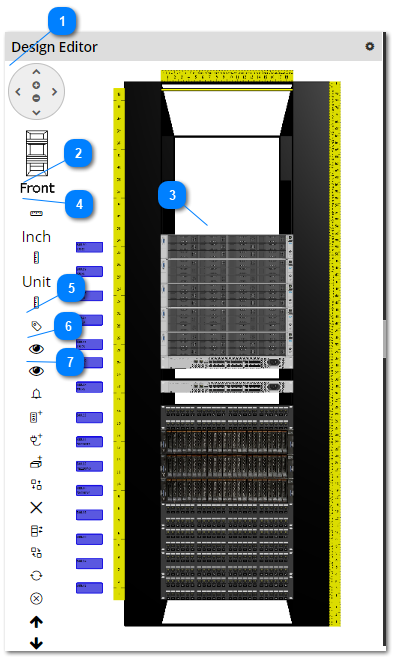
There are several buttons/controls available in the Design Editor, right under the pan/zoom control. Some buttons are used to control the Rack view, other controls are used for managing Rack Equipment itself. The screenshot images and text below reviews the view controls in more detail.
Pan/Zoom control
The 3D view can be moved and zoomed in and out through the Pan/Zoom control
The 3D view can also be moved by clicking and dragging the mouse around the Design Editor
The 3D view can also be zoomed by rolling the mouse wheel.
The 3D view can also be rotated by right-clicking and moving the mouse left-right
- The Front (text) button displays the front rack view in the Design Editor and toggles the Front button to indicate Back and puts the rack view control buttons in the back mode.
- The top section of the Front Rack icon highlights yellow when hovering over it with a cursor. When clicked, it displays the top third section of the front rack view in the Design Editor.
- The middle section of the Front Rack icon highlights yellow when hovering over it with a cursor. When clicked, it displays the middle third section of the front rack view in the Design Editor.
- The bottom section of the Front Rack icon highlights yellow when hovering over it with a cursor. When clicked, it displays the bottom third section of the front rack view in the Design Editor.
- The Back (text) button displays the back rack view in the Design Editor and toggles the Back button to indicate Front and puts the rack view control buttons in front mode.
- The top section of the Back Rack icon highlights yellow when hovering over it with a cursor. When clicked, it displays the top third section of the front back Rack view in the Design Editor.
- The middle section of the Back Rack icon highlights yellow when hovering over it with a cursor. When clicked, it displays the middle third section of the back Rack view in the Design Editor.
- The bottom section of the Back Rack icon highlights yellow when hovering over it with a cursor. When clicked, it displays the bottom third section of the back rack view in the Design Editor.
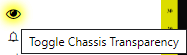
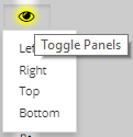
Clicking on the Toggle Panels (Eye) toggle button displays a small drop-down menu displaying the 4 Rack / chassis panels displayed inside the Design Editor.
Click on any of those choices displays / hides the selected Rack panel.


 - The Front (text) button displays the front rack view in the Design Editor and toggles the Front button to indicate Back and puts the rack view control buttons in the back mode.
 - The top section of the Front Rack icon highlights yellow when hovering over it with a cursor. When clicked, it displays the top third section of the front rack view in the Design Editor.
 - The middle section of the Front Rack icon highlights yellow when hovering over it with a cursor. When clicked, it displays the middle third section of the front rack view in the Design Editor.
 - The bottom section of the Front Rack icon highlights yellow when hovering over it with a cursor. When clicked, it displays the bottom third section of the front rack view in the Design Editor.
 - The Back (text) button displays the back rack view in the Design Editor and toggles the Back button to indicate Front and puts the rack view control buttons in front mode.
 - The top section of the Back Rack icon highlights yellow when hovering over it with a cursor. When clicked, it displays the top third section of the front back Rack view in the Design Editor.
 - The middle section of the Back Rack icon highlights yellow when hovering over it with a cursor. When clicked, it displays the middle third section of the back Rack view in the Design Editor.
 - The bottom section of the Back Rack icon highlights yellow when hovering over it with a cursor. When clicked, it displays the bottom third section of the back rack view in the Design Editor.
 - The horizontal ruler toggle button displays / hides the top horizontal ruler.
 - The Inch ruler toggle button displays / hides the right vertical ruler.
 - The Unit left ruler toggle button displays / hides the left vertical ruler, which has its measurements in Rack Units (1 RU = 1.75").