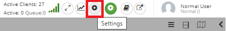
In IRM there is a simple mechanism for the application to store and retrieve various settings that are kept on a per-user basis. Each of these settings can be updated and applied to the current user session at any time. This functionality is enabled through the User Settings dialog, accessible by clicking the black and white gear icon near the user information in the top right corner of the main application screen:
Important: User Settings should not be confused with IRM Global Settings, which are for the entire IRM installation, not per user.
The following are some of the important design elements of User Settings:
the User Settings are persisted on a per-user, per-Site basis
default settings are used when a new user is created
most settings affect the current operation / session of the user
some settings are also editable on the Global Console; those are distributed from the Global Console to all of the Sites in the installation
The following screenshots breakdown the Use Settings by Tab and Section. In User Settings, there are 2 tabs, Common and Drawing.
Common: is used primarlity to define dialog, pops and UI options.
Drawing: is sued to define display items specifc to the design world window.
The following sections provide a breakdown of the options available in both UserSetting tabs.
User settings - Common tab
In the User Settings dialog most of the settings are organized as Field Name - Value pairs listed in separate rows. Some more common settings are displayed as different interface elements (covered in more detail in following sections).
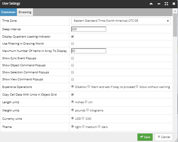
First setting on the list is the Time Zone, enabling each user to choose a different time zone. The value is represented as a drop down menu listing all the time zones by their standard name, standard time zone abbreviation and the offset value. IRM automatically switches the user between the standard time version of a timezone and the daylight savings time version, on the right dates. For example, if the user sets PST (or EST) in early March, in late March the user Settings timezone automatically changes to PDT (or EDT).
The Sleep Interval property enables specifying the time length (in minutes) after which the the application will automatically go to sleep mode, if no user activity was made during that period. This is useful in cases when the application and/or browser tab to get into bad states if left open and active for excessively long periods of time (days). This feature is meant to put the Web Client into an inactive state where it does not use resources, and also to restart it after waking.
Note: If the WebClient goes to sleep and then it's session times out (due to the Global Settings Auto Logoff Absolute Timeout), the WebClient's tab gets closed and the user gets re-directed to the Global Console Login screen, showing an additional message that the user has been logged off.
The next setting in this dialog is the Display Quadrant Loading Indicator, which enables a small Loading... indicator displayed near the top-left corner of quadrants in the Design World, as they are being loaded. This is option useful when working with complex drawings in the Design World, as there may be cases where the application takes a few seconds to load a quadrant (a quadrant is just a rectangular portion of the Design World display).
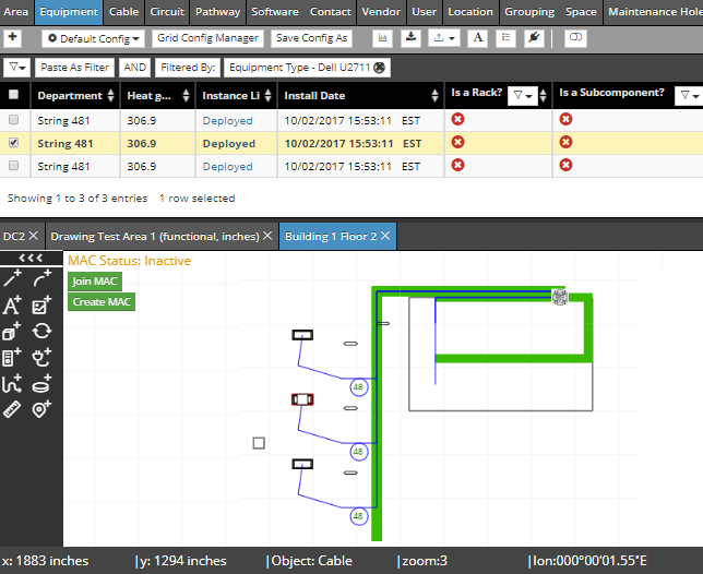
By default, Object Grid filters do not apply to the Design World, but enabling the Use Filtering in Drawing World setting means that Object Grid filters do affect which objects are shown in the Design World. For example, we might want to only show equipment objects of a certain Type in both the Object Grid and the Design World. With this setting enabled, that filtering is done simply by double-clicking on the desired Equipment Type in the C&T tree, which will then filter both the Equipment tab and the Design World to only show objects of that Type:
The Maximum Number of Items in Array to Display setting is used to restrict the number of items to be displayed as displaying a large number of items in a small area (i.e. in a grid cell) can cause problems with overlapping or accessing parts of the interface. If an array has more elements than what the upper bound allows, only the specified maximum number elements will be displayed, followed by a "..." to indicate that there are more elements.
The following items allow the user to control which types notification popup dialogs (in the top-right corner) get shown:
Show Sync Event Popup
Show Object Command Popup
Show Selection Command Popup
Show View Command Popup
The Expensive Operations setting enables the user to specify how to handle operations expected to take longer than a several seconds to complete. The user can set one of the following choices, all of which result in a pop-out dialog with appropriate warning text (and confirmation buttons) to be displayed before proceeding (or not proceeding) with the operation:
Disallow, Warn and ask if okay to proceed or Allow without warning.
The Copy Cell Data With Units in Object Grid toggle option enables the user to specify if the cell data displaying units is copied with or without the unit. This situation is analogous to cases in spreadsheets where sometimes the user wants to paste the final data, sometimes the formatting, sometimes the formula, etc. By default, cell data is being copied with units. More details about the Object Grid selection mechanism can be found under the following topic.
Length Units, Weight Units and Currency Units toggle settings specify which of the following units are displayed for length, weight and currency throughout the application:
centimeters or inches
pounds or kilograms
USD or CAD
Last from this section, the Theme setting enables user to set the color theme of the application to either light or dark.
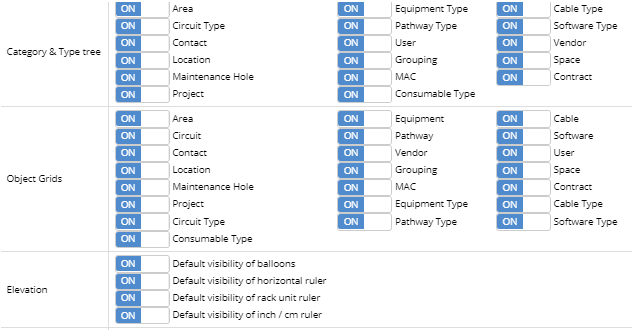
The section of the User Settings dialog from the screenshot above contains controls for specifying which sections or tabs are available in several important Main Screen sections of the application - the C&T tree, the Object Grids and the Elevation dialog. Because IRM supports such a large number of object types, this can help users to reduce screen clutter and focus on the types of objects that they care about most.
The Category & Type tree section allows the user to specify which Super Categories are available in the Categories and Types tree in the main application screen. Similarly, it is also possible to enable / disable different Object Grid tabs via the radio button next to the name of the Super Category (Object Grid tab). In addition, it is also possible to enable / disable visibility of different UI elements in the Elevation dialog - balloons (tags displaying Equipment Labels) and different rulers (horizontal, rack unit and inch/cm rulers).
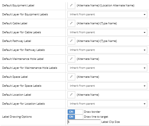
The Label and Label Layer settings shown above enables the user to specify several default label options creating Labels for the following Managed Objects:
Equipment
Cable
Pathway
Maintenance Hole
Space
Location
the Default <Managed Object> Label Field to be assigned when creating a Label object, which is basically a settable default String for Labels and is used whenever a new Label is created.
the Default Layer for <Managed Object> Layer represented as a dropdown menu displaying a list of Layers corresponding the list from the Label variety in the Layer Manager dialog. An alternative option in the same dropdown is the Inherit from parent, which is set by default, as displayed in the screenshot above. This sets the Label layer style to the one specified for the parent object.
several Label Drawing Options:
enable/disable border drawing around the Label object
enable/disable drawing the line from the Label object to the target object
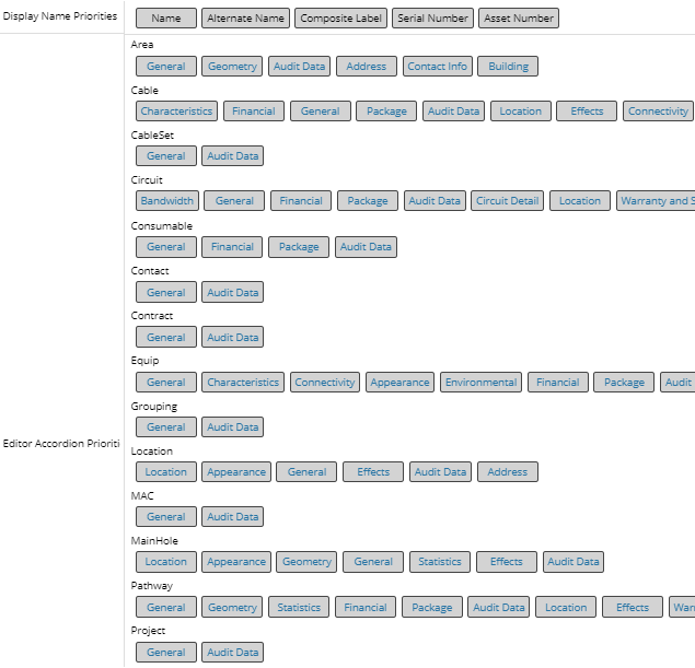
The Display Name Priorities setting enables the user to specify the priority of different fields that may represent the name of the object simply by clicking on one of the tags displaying the field name and dragging it to the desired priority position. In the example from the screenshot, the Name field has the biggest display priority, which means that, the Name field will be displayed as a default name field for all objects. In case there is an object that has no value specified for the Name field, the Alternate Name field will be used as a default name field, and if that one isn't specified it's the Composite Label field and so on..
The Editor Accordion Priorities controls the ordering of accordion sections within the various object Property dialogs -- the left-to-right order in the setting becomes the top-to-bottom order of the accordion sections in the dialog. Given the large number of fields supported by IRM, this feature helps users to place data they are more interested in near the top of the dialog, or to organize the fields in a way that makes more sense to them.
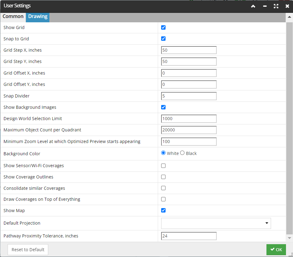
The Drawing tab is reserved for the following set of Design World-related settings:
Show Grid - turns the grid lines on or off (makes them visible or invisible).
Snap to Grid - forces objects being moved in the Design World to snap to the active grid step and Snap Divider values.
Grid Step X/Y - X / Y size of the grid lines
Grid Offset X/Y - X / Y offset of the grid lines
Snap Divider - allows for the defined grid point to be divided into smaller snapping point. For example, if Snap Divider is set to 5 and the grid Step is set to 10, then objects can be snapped to points 0,2,4,6,8,10 within the the grid step. This allows a smaller snapping grid to be defined while still being able to display a large grid.
The Show Background Images option enables all background images to be displayed or not displayed.
The Design World Selection Limit setting is used to restrict the number of Design World objects that can be selected, since selecting a large number of objects can cause web browser performance issues.
Maximum Object Count per Quadrant typically set at 20k to prevent overwhelming the Web Client/Browser. you can customize this value up to 100k or more if they wish to view densely populated areas.
Minimum Zoom Level at which Optimized Preview starts appearing determines the zoom level switches from a lower-quality preview to a higher-quality or more detailed view as you zoom in.
Background Color setting allows the user to specify the background color of Design World Area(s) to be Black or White (default). This implies that all object layer colors that are the same color as the background color are inverted so that they do not appear invisible. For example, a white layer on white background is drawn as black line, while in the opposite scenario a black layer on black background is drawn as a white line. If changed, this setting applies instantly on all opened and newly opened Areas upon saving the User Settings.
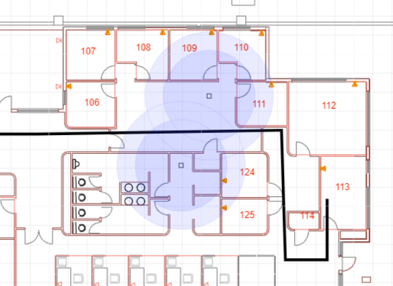
Show Coverages displays the coverage areas of sensors and Wi-Fi networks . It provides a detailed representation of signal strength and range, allowing users to assess and optimize their network coverage for improved connectivity and performance.
Show Coverage Outlines It shows the coverage areas of different networks, like Wi-Fi, cellular, and sensor networks. It displays clear outlines or boundaries that define the extent of network coverage, aiding in analyzing signal strength, range, and potential dead zones. This information assists in optimizing network deployment and ensuring effective connectivity across desired areas.
Consolidate Similar Coverages combines or merges overlapping or similar coverage areas within a network. It helps streamline and optimize network deployment by reducing redundancy and eliminating unnecessary overlap. By consolidating similar coverages, network resources can be utilized more efficiently, leading to improved performance, reduced interference, and better overall network management.
Draw Coverages on Top of Everything refers to a functionality that allows the visual representation of coverage areas to be overlaid on top of other elements or layers in the Design World display
Show Map - if checked, the relevant geo-referenced map from the mapserver is displayed when the Area is opened.
Default Projection - The list of map projections IRM supports to apply as a coordiante overlay for a geo-reference Area. While our system supports using other geospatial coordinates, the Web Mercator Projection, aka “the Google projection” appears to be by far the most commonly used today.
