IRM Global Console provides a feature which allows the user to view various analytical data represented as dashboards. The idea behind this feature is to enable the client can read data from multiple Site master servers and present it on a single dashboard. The user is able to choose which metrics he is interested in, from a pre-defined set, then choose the graph style for each metric, and the placement (location and size) of the graph on the dashboard. Also, the user can create and view multiple dashboards, and access them in separate browser tabs.
For example, user can view simple data, like counts of the number of instances for each Equipment, or Cable category and type. Furthermore, the user is able to see the data series for a specific Site, or for all Sites aggregated.
Most of the data displayed via Dashboards fall into one of two categories:
Data displayed over some period of time, where we record the value of the metric at some regular interval, and display it over time.
The user is able to choose between:
different types of graphs (line graph, bar graph, scatter graph, etc.).
different time scales, minimally hours vs. days vs. weeks.
For items where the graph is showing more than one series of data (e.g. “count of instances by Life cycle Stage”), the user is able to select or deselect each series for inclusion/exclusion in the graph. This way, the user can remove the clutter of any data series he is not interested in, which is especially important for the items that break down by Managed Object Type or Cable Type, as there can potentially be lots of Types that would cause clutter if the user could not deselect them.
For the “comparison” items, we are just showing the current values of each data item vs. the others. For example, for “count of instances in each Life cycle Stage”, we just want to compare how many equipment items we have on order vs. how many are deployed vs. how many are broken. he user is able to choose between graph types suitable for comparison, such as a pie graph, wedge graph, or bar graph.
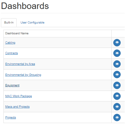
The Global Console's Dashboard page lists the available Dashboards by the Super Category of the represented object. By click on the Dashboard Name or the "eye" icon next to it, the user gets redirected to a new browser tab that displays Dashboard page in detail.
The following subtopics explain basic types of different Dashboard data, broken down by the Super Category of the represented objects, while the paragraph below explains just the basic common features of each.
Common Dashboard properties
Each type of Dashboard contains the dropdown menu for Site selection, along with the Reload button to refresh the page and the data graphs:
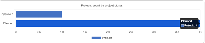
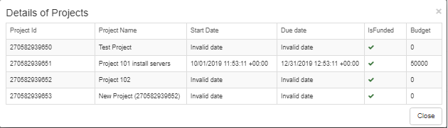
Also, it's possible to double-click on a bar in a chart or wedge in a pie chart, which displays a pop-out data grid listing details about the selected data. For example, if you're observing the Projects Dashboard displaying the Projects breakdown by project status and you click on the Planned bar, the pop-out data grid will display details of the four Project objects listed under the Approved Project Status, as seen below: