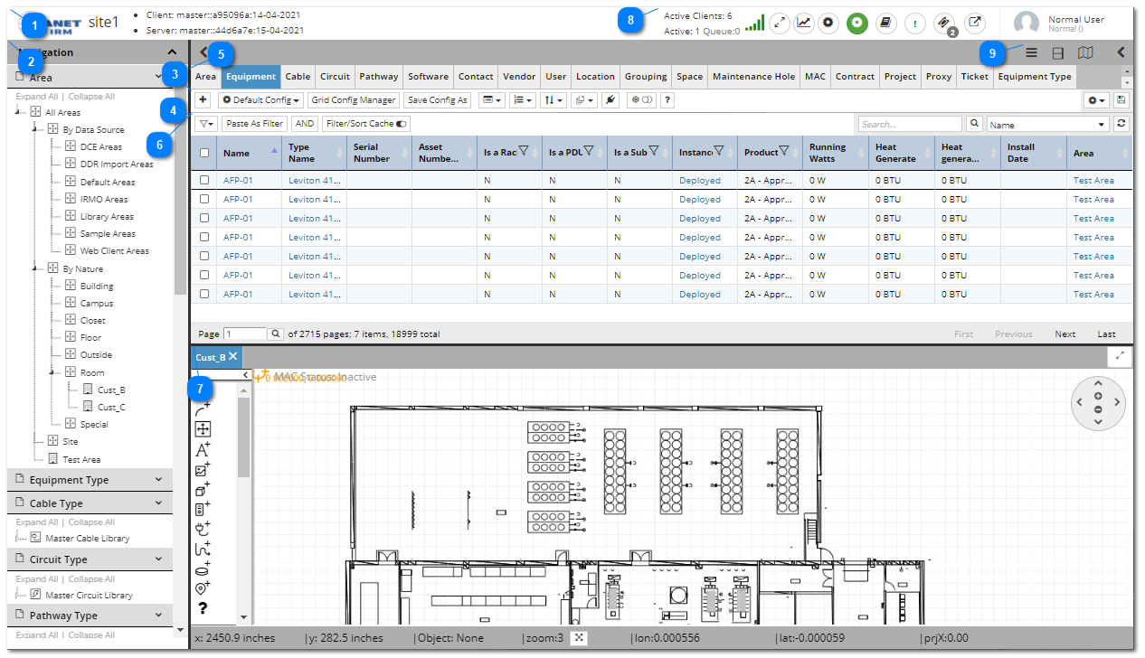
The IRM Web Client's Main Screen is the primary view presented when a specific Site is opened or the page is refreshed. It consists of several parts that enable specific features, all of which will be covered at a basic level in this section and in more detail in the following sub-topics.
Below is a screenshot of the main screen of the IRM application, followed by basic explanation of its main parts. For a more detailed explanation, please refer to the following subtopics.
Site Master info
Displays different Web Client information, such as used memory (available on Chrome only), the number of quadrants and objects cached, etc. On the left side of this area, the Planet IRM logo is displayed. Click on it navigates back to the Global Console screen.
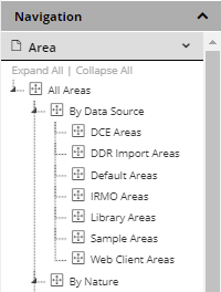
The Navigation panel, or commonly called, the Categories and Types tree, contains a set of expandable accordion sections, each corresponding to one of the Super Categories (Equipment, Cable, Location, Circuit, etc.). Each accordion section expands into a tree control when clicked, the contents of which follow a two-level tree structure: Category -> Type or Instance. Importantly, a single type or instance object can be in multiple categories at once, for example a switch type can be in both a manufacturer category (e.g. “Dlink”) and a functional category (e.g. “Switches”). As part of the IRM Library, IRM provides a number of pre-defined Categories within each Super Category. The user has full control of the Categories defined in the tree and and can create, modify, delete or re-organize the tree into a structure that meets their specific operational needs. However, Planet Associates strongly recommends using the default organization of Categories as it is quite comprehensive and powerful while remaining simple.
For more details about the Categories & Types panel, click on the following topic - Categories & Types Panel.
This toolbar contains multiple different buttons, some of which are grouped as they are related to the same feature - the following subtopic provides a detailed explanation of each of them.
This toolbar contains different UI controls, that enable adding and managing user filters applied to the Object Grid. Each of these UI elements have a specific function, as explained in the following subtopic.
This bar contains a group of multiple tabs, each of which represents a major IRM object type (Equipment, Cable, Location, Circuit, etc.). Selecting a tab (the Space tab is highlighted in blue in the screenshot) causes the Object Grid (item 5) to display a list of objects of the corresponding type.
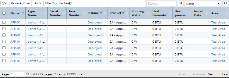
This data grid displays a separate independent data view for each object tab, while also providing different convenient filtering and sorting options, as explained in detail in the following subtopic.
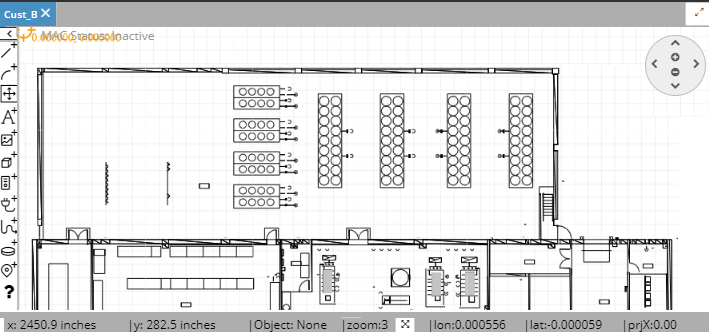
This section of the Main Screen is a rather complex and capable Graphical Area View or Design World, which consists of the main drawing canvas area, toolbox and separate tabs for each opened Area.
The top-right corner of the main IRM application screen is dedicated to accessing settings dialogs and for displaying basic user information and some additional controls:
- Fullscreen - click on this button opens the IRM application in a full screen view (mode), which can be exited by pressing the Esc button on the keyboard.
-User settings - click on this button opens the User Settings sub-dialog.
- Global settings - click on this button opens the Global Settings sub-dialog.
The remaining content (user icon), user name, user type and contact email address are simple read-only labels and are displayed for informational purposes only.
Note: The user does not log into or out of the IRM Web Client; those operations are done via the Global Console.
There are two Toggle Sidebar buttons in the main application screen, placed on the top-left and top-right corners above the Object Grid tabset. They enable toggling the view of the far left (Navigation) and the far right (Quick View) panels.
Click on the left toggle sidebar arrow button one the left side hides (closes) the Navigation panel and expands the Object Grid and the bars above it over the Navigation panel area and the button changes its view to a right-side arrow. Click on it expands the Navigation panel and compresses the Object Grid (and other associated UI elements).
Click on the right toggle sidebar arrow button in the right side hides (closes) the Quick View panel, expands the Object Grid and the bars above it over the Quick View panel area and the button changes its view to a left-side arrow. Click on it expands the Quick View panel and compresses the Object Grid (and other associated UI elements).

 - Fullscreen - click on this button opens the IRM application in a full screen view (mode), which can be exited by pressing the Esc button on the keyboard.
 -
-  -
- 