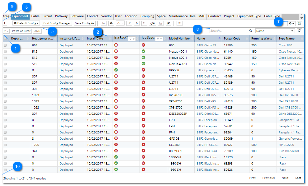
The Object Grid is the main data grid in the Main Screen that displays object instances for the selected Object tab. Selecting a tab causes the Object Grid to display a list of objects of the corresponding type.
There is a separate tab for each major variety of IRM objects, including both Type and Instance objects:
Type Objects
Equipment Type
Cable Type
Instance Objects
Equipment
Cables
Pathways
Circuits
Users
Vendors
Contracts
Projects
By clicking on one of these changes not only the contents of the Object Grid, but also the Function and Filter tabs, which display which Grid Configuration and/or Filter is applied to the selected Object Grid view.
The resulting data can be filtered and arranged in several ways:
applying User / Named Filters
applying Quick/ Convenience Filters
using Grid Configuration
adding / removing visible columns using cog icon
column order can be set by dragging and dropping column headers into preferred order
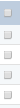
In general, any Object Grid column with a filter (funnel) icon in the header enables filtering column data. In this example, filter icon opens a menu with only two choices, which filter Rack Equipment versus non-Rack Equipment.
In another example, for Equipment Type tab it is possible to Filter column data by Release Stage in several ways:
using Quick Filter (see point 7),
using User defined Filter = None,
or using the filter icon on Release Stage column
The column filter opens a pulldown that enables applying quick filter directly from the column values, including the None option. This works in same way as Lifecycle, Is PDU, Is Rack column filters.
Note: the Release Stage is a Library-related built-in enumeration, not available for editing like other Extendable Enumerations features.
Object Grid provides a column filter for every enumeration and extendable enumeration column.
This section of the filter tab enables viewing and managing different types of filters - Named filters, Convenience filters and Quick filters. In the current screenshot, the applied filter Area - Building 1 Floor 2 is displayed as a button / tag next to the Filtered By: label. The name of the applied filter indicates this is a Convenience filter, which is added by double click on an Area element from the Area C&T tree menu.
This section of the Function tab enables viewing and managing Grid Configurations. In the current screenshot, the name of the applied grid configuration is displayed as a text label the first button in this section.
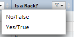
This control enables selecting which columns to display in the Object Grid for the currently selected tab, similarly to the Grid Configuration.
Click on this button displays a drop down menu (indicated with the additional down arrow icon), displaying a Search text input field and a (scrollable) list of checkboxes representing names of the available columns for the selected object tab:
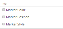
The Search textbox enables filtering the list of columns by a string, or even a single character. Once a character is entered, the list is filtered using the entered character(s) as filter criteria and the resulting column names all contain the entered character(s):
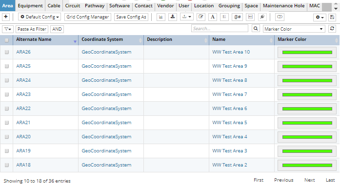
Click on an empty checkbox next to a column name immediately adds the selected column to the Object Grid. For example, if the Marker Color column name was selected in the previous step, it would be added to the current Object Grid View immediately:
This section of the filter tab enables managing Quick filters. In the current screenshot, the applied filter Area - Building 1 Floor 2 is displayed as a button / tag next to the Filtered By: label. The name of the applied filter indicates this is a Convenience filter, which is added by double click on an Area element from the Area C&T tree menu.
This bar contains a many tabs, each of which represents a major IRM object type (Equipment, Cable, Location, Circuit, etc.). Selecting a tab (the Equipment tab is highlighted in blue in the screenshot) causes the Object Grid to display a list of objects of the corresponding type.
